

You've decided you need an explainer video. You've settled on a budget, locked in a timeline, and you're ready to move. Then comes the question that most companies brush past: where is this video actually going to live?
"On the homepage. Maybe LinkedIn."
I bet that's what you think 8 times out of 10. And you're not wrong - but you're incomplete in a way that costs companies real money.
The Real Problem With "Just Put It Everywhere"
Here's what most teams don't realize: an explainer video isn't a single asset you place once and forget. It's a communication tool. And like any tool, its effectiveness depends almost entirely on where and how you deploy it.
After analyzing 100s of explainer videos, I've watched identical videos perform dramatically differently based on placement alone.
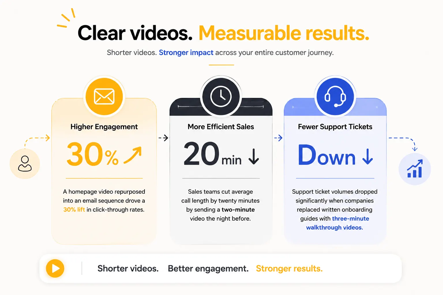
- A homepage video repurposed into an email sequence drove a 30% lift in click-through rates
- Sales teams cut average call length by twenty minutes by sending a two-minute video the night before
- Support ticket volumes dropped significantly when companies replaced written onboarding guides with three-minute walkthrough videos
The pattern is clear: placement is a strategic decision. Get it right, and the video delivers real business value. Get it wrong, and it sits on a page and collects nothing.
The Framework: 7 Placements, 7 Different Jobs
Here's where explainer videos actually work - what each placement asks them to do, and what that means for how the video itself should be built.
1. The homepage
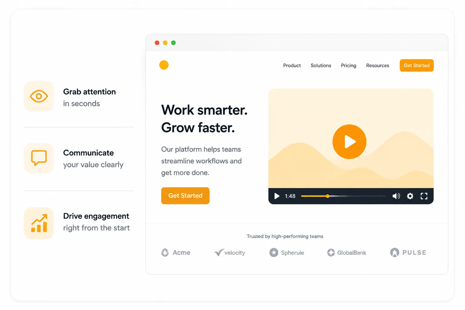
The homepage is where most companies put their explainer video. It's also where the stakes are highest and the attention window is shortest.
A homepage visitor typically arrives with an unspoken question: Is this relevant to me?
They're not ready to read deeply. They're not ready for a detailed product explanation. They're scanning for a signal that your company understands their situation well enough to deserve thirty more seconds of attention.
The job of a homepage video is not to explain everything. It's to make the right visitor feel immediately seen and make the wrong visitor self-select out quickly.
“Both outcomes are valuable - a homepage that converts 4% of highly qualified visitors is more useful than one that engages 20% of visitors who will never buy.”
This changes how the video should be built:
- Open on the viewer's problem, not your product
- Use specific, textured language that reflects how your ideal buyer actually describes their frustration (not the sanitized marketing version)
- Close on a single, clear CTA that matches where a cold visitor actually is in their journey (usually a free trial, demo booking, or resource download)
Length: 60-90 seconds
What to measure: Watch scroll depth alongside video completion. If people watch the video but don't scroll further, the video isn't creating enough curiosity and confidence to drive exploration.
2. Landing pages and paid ads
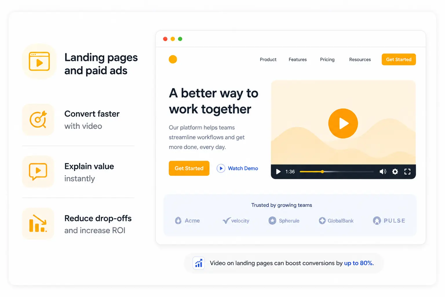
A landing page visitor is not a cold prospect - they've already done something. Clicked an ad. Followed a link. Responding to a campaign. They arrived with context and intent.
The video's job here is fundamentally different. It's not introducing - it's converting intent that already exists.
This changes everything about how you write it. A landing page video can move faster to the solution because the viewer has already demonstrated interest.
It can be more specific about the use case the ad referenced, the segment the campaign targeted, the outcome the offer promises. It can ask more directly for action because the visitor is already in a decision posture.
The critical alignment problem
Here's what kills most landing page video performance: misalignment between the ad and the video.
We've audited dozens of landing pages where the paid ad makes a specific promise like "cut your reporting time in half," but the landing page video opens with a generic product overview that doesn't mention reporting at all.
The visitor who clicked on a specific promise arrives at a generic explanation. That trust gap is often the entire reason the page underperforms.
The rule is simple: The first line of your landing page video should echo the specific promise that brought the visitor there. They should arrive, watch the first ten seconds, and think: Yes, this is what I came for.
For paid social ads
The constraints are tighter. Autoplay without sound is the default on every major platform. The first two seconds of the visual - before voiceover even registers - determine whether someone stops scrolling.
And the video needs to work in 9:16 vertical format on mobile just as much as widescreen. These are production decisions that need to be made at the brief stage, not figured out after the fact.
3. Product and Feature Pages

This is the placement most companies underinvest in. It's also often the one that drives the highest ROI when done well.
A visitor on a product or feature page is not a cold prospect. They've already cleared awareness and interest.
They're now in evaluation mode, actively trying to understand whether this specific feature solves their specific problem well enough to justify the decision.
The video on a product page is doing a completely different job than the homepage video. It needs to demonstrate capability. To show how the feature actually works and what changes for the user when it does.
Check this out: Understand how explainer videos deliver strong ROI across marketing channels
The one-workflow-shown-exceptionally-well principle matters most here. A product page video that tries to cover five features in ninety seconds covers none of them convincingly.
A video that shows one complete workflow - from user action to product response to outcome - creates the specific confidence a consideration-stage viewer needs.
Real example: The pipeline review video
We produced a feature page video for a revenue intelligence platform that focused on a single workflow: a revenue leader arriving at a Monday morning pipeline review with complete, real-time deal data instead of the usual patchwork of manually pulled reports.
Ninety seconds. One workflow. The feature page conversion rate improved by over 35% for visitors who watched the video versus those who didn't.
Not because the feature was new. Because seeing it in context, narrated in the language of outcome rather than mechanics, made the value undeniable in a way the written feature description hadn't.
4. Email Marketing

Email is where explainer videos are most underused and where the lift from using them correctly is often most immediately measurable.
The mechanics are simple: Emails that include video, or even the word "video" in the subject line, consistently outperform those without - across open rates, click-through rates, and downstream conversion.
Video signals that something worth watching is inside, which changes the recipient's posture before they've even opened the email.
But the more important insight is about which video goes in which email.
Cold outreach vs. nurture
A cold outreach email is not the place for your homepage explainer. A cold prospect hasn't yet been given a reason to invest two minutes in a product overview.
For cold outreach, the video should be:
- 30-60 seconds maximum
- Function like a hook: specific enough to be relevant, compelling enough to create curiosity
- Closed with a single low-friction next step
For nurture sequence emails, it's different. A prospect already in your funnel, who's already demonstrated interest, can receive longer, more detailed videos - feature deep-dives, use case walkthroughs, customer outcome stories. The relationship has been established. The video can do more work.
For post-demo follow-ups, a short recap video of two to three minutes, structured as a summary of what was discussed plus a clear restatement of value, keeps deals moving during the internal approval stage. It gives your champion something to forward that does the explaining on their behalf.
A practical note on thumbnails
Most email clients don't play video natively. The standard approach is embedding a static thumbnail with a play button overlay that links to a hosted video page. That thumbnail is a creative decision - the frame you choose determines whether anyone clicks.
5. Social Media and Content Hubs

Social media is where most companies think about video first but lack any intentful strategy. The mistake is treating social video as a distribution channel for your homepage explainer.
Upload the same video to LinkedIn. Move on. The result: a video that performs modestly because it was built for a completely different context.
Social media video (LinkedIn Especially)
Social operates under constraints the homepage doesn't have:
- Autoplay without sound
- A three-second window before scrolling
- A feed full of competing content from people your audience already chose to follow
The video that works here is shorter, more opinionated, and structured to deliver value in the first five seconds rather than build to it.
Think of social video as the top of a content funnel, not as a placement for your primary explainer.
A thirty-second video that makes one strong claim about why most SaaS demo videos fail in the first ten seconds will drive more qualified traffic to longer content than a ninety-second product overview ever will. Because it leads with value, not product.
Content hubs
YouTube channels, resource pages, blog pages - these are where longer, more educational video content earns its place.
A five-minute guide on structuring a product demo video script. A ten-minute breakdown of what makes B2B video convert. A case study walkthrough of a specific client outcome.
These videos build SEO authority, establish expertise, and attract buyers in research mode rather than decision mode.
6. Internal communications and sales enablement
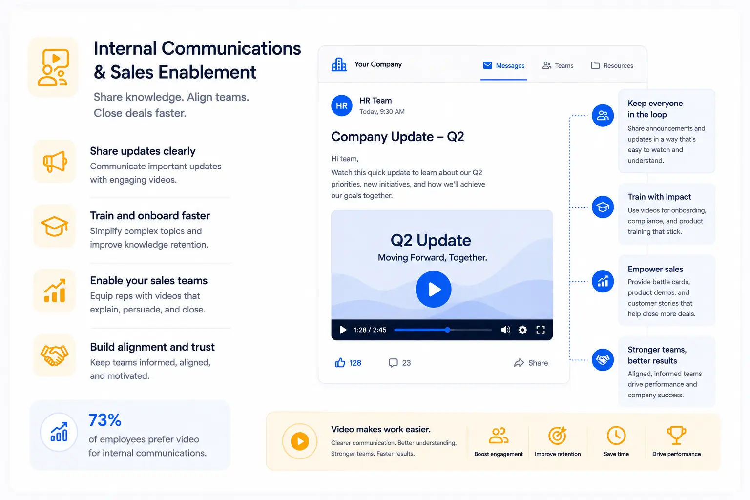
This is the placement that consistently surprises clients when we raise it - and where some of the most significant operational value from video gets captured.
Sales enablement video goes beyond pre-call explainers. The scope is broader:
- Product update videos sent when new features launch mean every rep speaks from the same informed starting point, not from whatever they retained in the all-hands meeting
- Competitive positioning videos that show exactly how to articulate differentiation against a specific competitor give every rep a consistent, tested message instead of an improvised one
- Training videos, onboarding sequences, process documentation - these replace slow, inconsistent, expensive human-delivered equivalents with something that scales without degradation
The consistency argument is simple: human beings are unreliable vessels for information. The more a message travels through multiple people, the more it degrades. Video stops the degradation. The tenth person gets the same message as the first.
Enterprise scale
For larger enterprise clients like HighRadius, which used video to train over 10,000 employees, video became an operational asset.
For early-stage SaaS, the most immediately valuable internal video is often the simplest: a two-minute product overview that every customer-facing person watches and references.
When every person talking about the product has internalized the same narrative, the story told to the market becomes consistent in a way no style guide or messaging document can produce.
7. Support and Knowledge Bases

This is the placement with the most under appreciated impact on a metric most SaaS companies track obsessively: churn.
Support videos and knowledge base walkthroughs aren't glamorous. They don't get shared on LinkedIn. They don't drive new signups. They don't appear in case studies about conversion improvements.
What they do is quietly determine whether a user who signed up actually becomes a user who stays.
The pattern is consistent across SaaS companies we work with:
A user encounters a feature they don't immediately understand. They look for help. If they find a written help article with screenshots, some work through it.
A meaningful percentage don't - and over time conclude the product is more complicated than it's worth.
If they find a two-minute walkthrough video that shows exactly what they were trying to do, narrated in plain language with visual cues pointing to the right element, almost all complete the task.
A user who completes a task has a fundamentally different relationship with the product than one who didn't.
Fronter reduced onboarding time by 50% with video-led support content. That number represents the difference between users who reached core value quickly and users who didn't. Users who reach value quickly retain. Users who don't, churn.
The brief for a support video is the simplest on this list: Show one task completely. Narrate the outcome. No brand storytelling. No emotional arc. Just the clearest possible demonstration of how to do the specific thing the user came to learn.
The Question Comes Before the Production
Everything above points to one conclusion, and it's the one I try to make early in every client conversation:
The question of where a video will live should be answered before the question of what the video will say.
Because placement determines viewer context. Viewer context determines what the video needs to do in its first eight seconds, its middle section, and its closing frame. A video built to work everywhere ends up built for nowhere.
The highest-performing companies we work with treat video placement as a strategic map. They identify specific points in their buyer journey where understanding breaks down, where prospects go quiet, where trials don't convert, where new users don't activate.
Then they build videos that address those exact friction points in the context where the friction occurs.
That's a different brief than "we need an explainer video." It's a more useful one. And it's the brief that produces videos still working six months after launch.