


A few months ago, a SaaS founder shared with us their latest product video.
Honestly, at a first glance it looks pretty on the surface, slick animations, great music, professional voiceovers and the whole package.
But something felt off.
The interface on screen just sits there. Screens change, but nothing happens. Buttons don't respond. Menus don't move. Data doesn't shift. It's polished on the outside and completely hollow on the inside.
The product itself? Genuinely impressive. Thoughtfully built. Clearly the result of months, maybe years, of hard work.
But the video? The video made it look like an artifact from 2014.
We've seen this story play out across dozens of SaaS companies, at every stage, with every size of budget.
And every single time, the cost is invisible, not because it doesn't exist, but because most teams never connect the dots between what their video is communicating and why their conversion numbers aren't moving.
So let's connect those dots.
Video Isn't a Marketing Channel Anymore. It's the First Handshake.
There was a time when a product video was a nice addition to a landing page. Something to break up the text. A bit of visual interest for visitors who didn't feel like reading.
That time is long gone.
Today, video is the first meaningful interaction most buyers have with your product, before they speak to sales, before they start a trial, before they've read a single line of your feature page. It carries the entire weight of that first impression, and it carries it in seconds.
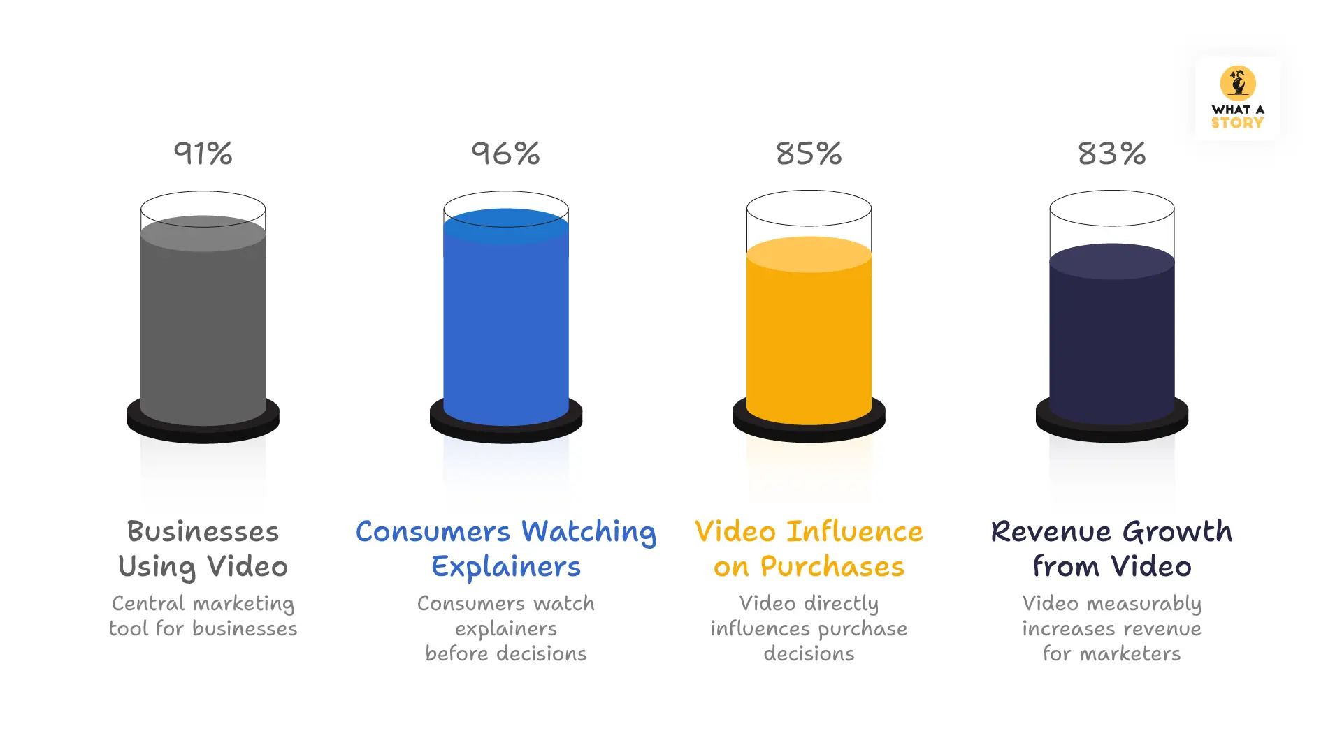
The numbers are no longer surprising to anyone paying attention:
- 91% of businesses now use video as a central marketing tool, not a supplementary one
- 96% of consumers have watched an explainer video before making a product decision
- 85% of people point to video as a direct influence on something they purchased
- 83% of marketers report that video has measurably moved their revenue
But here's what those statistics don't tell you, and what we think matters far more: video doesn't just inform. It persuades. It reassures. It answers the question that every buyer is silently carrying into every product interaction:
"Is this going to be worth my time, my money, and my trust?"
Why UI Design Plays a Central Role in Product Videos
There is one question sitting quietly in every potential customer's mind when they watch a product video:
"What is it actually going to feel like to use this?"
Not what it does. Not what it costs. Not what the feature list looks like.
What it feels like. And that question is the one that determines whether someone keeps watching or clicks away.
You can write the most compelling description of your product imaginable. You can put together beautiful screenshots and a feature list that covers every last capability your team has built.
But none of that shows a person how your product moves.
How it responds when you click something. How it guides you from one step to the next. How it feels when you are sitting down and actually using it on a busy afternoon with a deadline approaching.
Only a video can show that. And that is exactly why it matters so much.
The moment your product appears on screen, the person watching is already forming an opinion.
In those first few seconds, they are quietly asking themselves:
- Does the interface feel responsive?
- Does navigation look simple or confusing?
- Does the design appear current or outdated?
- Can I imagine using this every day?
The UI answers those questions immediately.
Product videos that show the software behaving naturally make people feel comfortable faster. There is no mental work required to imagine what using the product might be like, because the video is already showing them.
And when someone finishes watching and thinks "I get it, and I want to try it", that is not an accident. That is what happens when a product video is built around showing the real experience rather than just describing it.
That is the difference worth caring about.
Modern UI Trends Shaping Product Videos in 2026
Software has come a long way over the past decade. Interfaces are sharper, smoother, and far more thoughtfully designed than they were even five years ago.
Yet a surprising number of product videos haven't caught up.
The ones that do share something in common. They don't just show what a product looks like.
They show how it behaves. And that shift makes all the difference.
The small moments that change how people feel about your product
Think about the last time you used software that just felt good. Chances are, you weren't consciously noting any single thing. It was a collection of small moments.
A button that responded the instant you clicked it. A menu that opened exactly as expected. A small confirmation appears right after you completed an action.
These moments never show up in a screenshot. They rarely get mentioned in a feature list. But they are quietly responsible for whether a product feels polished and trustworthy or rough and unfinished.
When a product video captures these moments, the viewer doesn't need anything explained. They simply watch and understand. More importantly, they feel that the product was built with genuine care.
That feeling is worth more than any feature callout you could put in its place.
Guiding people through your product without losing them
There is an old way of making product videos that many companies still follow without realizing it.
Show a screen. Cut to the next. Show that screen. Cut again. By the end, the viewer has seen every feature and understood almost none of them because nothing was ever connected to anything else.
Natural movement through the interface solves this completely.
When navigation flows from one section to the next in a way that feels organic, the viewer isn't just watching separate features. They are following a journey and seeing how real work actually gets done inside the product.
This matters especially for products that do a lot of things. Workflow tools, data platforms, and collaboration systems are genuinely difficult to explain with words alone.
Smooth movement through the interface doesn't just make these products look better on screen. It makes them easier to understand.
And when someone truly understands your product, they are far more likely to believe it can help them.
Depth and layers that help people focus
Good software knows that not everything on a screen needs equal attention. Some things matter more than others, and the design should make that obvious.
Cards float above backgrounds. Key actions sit front and center. Supporting details stay visible but quietly out of the way.
The best product videos carry this same thinking into how the interface is presented. The important stuff stays sharp and clear. Everything else steps back just enough to let it breathe.
It sounds like a small thing. But viewers notice. And it makes the whole experience feel considered rather than cluttered.
Showing the product as it actually is
People can tell when a demo feels staged. They might not say it out loud, but something feels a little too perfect, a little too clean, and the trust that was starting to build quietly disappears.
The videos that work best simply show the product doing what it actually does:
- A cursor moving through real menus
- Someone typing into actual fields
- A dashboard updating as filters change
- A report refreshing with fresh data
No performance. No artificial polish. Just the product behaving the way it would on any normal working day. That honesty is what makes people feel comfortable enough to take the next step.
Getting out of the product's way
There was a time when product videos tried to do too much. Heavy graphics, busy overlays, visual effects stacked on top of more visual effects.
The product always got lost in the middle of it all.
The approach that works today is much simpler. Let the interface be the main character and keep everything around it calm and clean:
- Soft shadows that add a little dimension
- Gentle gradients that don't fight for attention
- Plenty of breathing room around the interface
- Simple typography that stays out of the way
When the product has space to speak for itself, it almost always says something worth hearing.
Data that moves is data that makes sense
For products built around numbers, a frozen chart rarely tells the full story.
When a chart updates as someone changes a filter, when a graph expands to show a trend unfolding, when numbers shift in real time as new information comes in, something clicks for the viewer. They stop seeing data and start seeing what the product actually helps them understand.
These moments tend to be the ones people remember long after the video has ended. Sometimes a single animated chart does more to explain a product's value than everything else in the video combined.
Letting smart features speak for themselves
There is a big difference between telling someone your product is clever and actually showing them what that looks like in practice.
Rather than calling attention to smart features with a graphic or a voiceover, the best videos just let them show up naturally:
- A useful suggestion appearing as someone types
- A recommendation surfacing right when it's needed
- An insight highlighting itself because the product noticed something worth flagging
Viewers see the product being genuinely helpful in a real moment. That lands far better than any description ever could.
Keeping things clear from start to finish
All of these elements add value. But pile too many of them together and the video starts working against itself. Too much movement, too many highlights, too many moments competing for attention, and the viewer ends up remembering nothing.
The videos that hold attention all the way through tend to follow a few simple rules:
- If an animation does not help explain something, it should not be there
- Transitions should feel like a natural next step, not a scene change
- What the viewer sees in the video should match what they find in the actual product
Simple as that.
A few things worth keeping in mind before you hit publish
If you are putting together a product video or giving an old one a refresh, these are the things that genuinely move the needle:
- Show a real task being completed, not just a list of features. People want to see how something gets done, not just what exists.
- Build toward the moment your product becomes obvious. Every product has that one point where the value just clicks. Let the whole video lead there naturally.
- Match the pace to the product. Something complex deserves a little more time. Something straightforward can move a bit faster. Do not rush what needs room to land.
- Keep the screen simple. One thing at a time. Viewers follow along much more easily when there is not too much happening at once.
- Make sure the video looks like the actual product. Colors, fonts, the way things move. If the video and the real product feel different, people notice. And it makes them wonder what else might not match up.
Product Videos That Showcase Modern UI Design
Several well-known SaaS companies already use modern UI storytelling in their product videos.
Slack
Slack’s product videos focus heavily on real interface workflows. Instead of explaining messaging features verbally, the videos show conversations happening inside the UI, reactions appearing, and notifications updating in real time.
This approach helps viewers instantly understand how the product fits into everyday work.
Notion
Notion’s product videos emphasize clean interface motion. The camera smoothly moves through pages, databases expand, and content blocks rearrange.
The result feels less like marketing content and more like watching the product being used live.
Figma
Figma often demonstrates features through collaborative UI interactions. Cursors move simultaneously across the screen, design elements update instantly, and comments appear within the interface.
These moments visually communicate one of the product’s biggest strengths—real-time collaboration.
What Video Experts Say About Product Videos
Video producers and marketing strategists consistently emphasize the importance of showing real product experiences.
Marcus Sheridan, author of They Ask, You Answer, explains the power of video clarity:
“When buyers can see how something works with their own eyes, trust increases dramatically.”
How Product Videos Improve Conversion Rates
Many SaaS companies discover the value of product videos after struggling with low conversion rates.
In one case, a company introduced a single product video on their landing page and saw conversion rates increase dramatically.
Research shows that landing pages with video can boost conversion rates by up to 80%.
The reason is simple. Videos reduce uncertainty.
Instead of guessing how a product works, viewers see the interface, the workflow, and the outcome in seconds.
For complex software products, this clarity often becomes the difference between curiosity and sign-up.
Here is a real case study to read: ZELIQ Raises a $15M+ Series A, Using a What a Story Explainer Video
A Simple Checklist for Modern Product Videos
Before publishing a product video in 2026, review these elements.
✔ Does the video show real interface interactions?
✔ Are microinteractions visible (clicks, menus, responses)?
✔ Is the UI motion guiding viewers through a workflow?
✔ Does the video highlight the product’s “aha moment”?
✔ Is the interface clear on both desktop and mobile views?
If a product video answers these questions clearly, viewers usually understand the product much faster.
Conclusion
A product video represents more than marketing content. It often becomes the viewer’s first experience of the product interface.
When that experience reflects modern UI behavior - responsive actions, guided motion, realistic interactions - the viewer understands the product quickly.
Confidence grows. Curiosity follows.
The most effective product videos allow people to experience the interface before opening the software.
For companies competing in crowded SaaS markets, that experience often determines whether a visitor keeps exploring or leaves the page.


